

Hally’s rebrand
A tangle of moments
About Hally’s
Hally’s is a neighborhood café located in the leafy suburb of Parsons Green, London. They've been serving the community for over a decade, offering a cozy and welcoming atmosphere. The owner, Anna, felt it was time for a brand overhaul and wanted a fresh, elegant, engaging, and energetic look. The solution lay in a design story titled "The Tangle of Moments.”
The Backstory
Anna, the owner of Hally’s, contacted me to redesign the logo and strategize a new visual system for the café. She wanted the brand to be instantly recognizable while reflecting the café’s elegant and energetic spirit. We developed "The Tangle of Moments” design story, incorporating the transient nature of coffee shop visitors into Hally’s identity.
This concept embraces the transience of coffee shop visitors, with a meandering journey line representing the flow of people into Hally’s and those walking by. Sometimes the lines cross, and sometimes the journey is solo, capturing the dynamic essence of the café.
Project Deliverables
Website design
Rebrand
Menu design
Layout & Typography
Bespoke Illustration set
Positioning story:
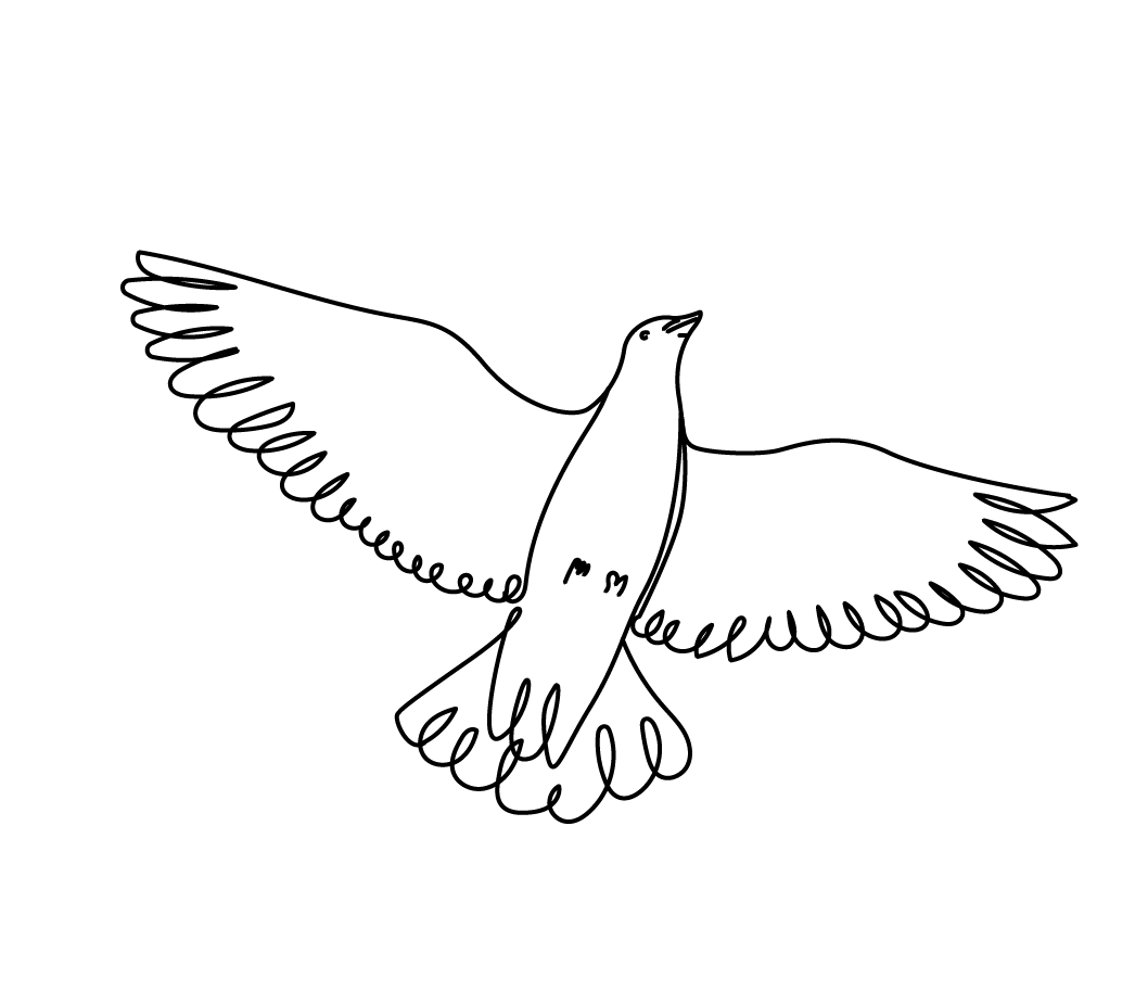
A tangle of moments
Hally’s is a quiet stage where life plays out in small, meaningful moments. Friends meet, strangers exchange glances, neighbours pause for a break. Then, just like that, life moves on. But for a brief second, all those threads touch.
This idea became the foundation of the rebrand: a visual system based on convergence, movement, and gentle entanglement. Inspired by light painting, tangled lines, and urban paths, we created a graphic language that mimics these shared instances — converging lines that tangle briefly before unravelling. We called this visual motif the wandering line — a storytelling device and a unifying thread across illustrations, packaging, menus, and digital touchpoints.
The moodboard pulled together influences from Picasso’s light paintings, hand-drawn maps, and the simple poetry of a line. The illustrations were deliberately loose and looping — capturing not just place, but energy. They wove around each other in a way that mirrored human interaction: casual, unpredictable, beautiful.
Beyond the concept, the work included a website redesign, new menus, tote bags, display cards, and product labels — all using this new language of lines to tell the Hally’s story. The result is a brand that feels as warm and lived-in as the café itself, with a sense of motion that reflects the city around i

Wandering paths
Converging paths and spontaneous meetings.
+

Light Painting
Capturing the fleeting traces of movement.
=

Moments Tangled
A tangle of moments captured in illustration.


Colours
The colour palette for Hally’s is designed to reflect the vibrant, easygoing spirit of the café. From the soft warmth of Flat White and the zesty lift of Mint Julep, to the grounding calm of Charcoal and the bright optimism of Sunshine, each hue brings an energy that matches the natural chatter and comfort of the space.
Flat White
CMYK: 0, 7, 7, 0
RGB: 259, 229, 239
HEX: FFEFE5
SunShine
CMYK: 0, 22, 97, 1
RGB: 255, 207, 71
HEX: FFCB47
Mint Julep
CMYK: 55, 0, 46, 0
RGB: 139, 196, 165
HEX: 87C4A5
Charcoal
CMYK: 69, 61, 62, 54
RGB: 56, 56, 56
HEX: 383838
From here to wherever
The table by the window was free, so I took it. A flat white, still hot enough to warm my hands, and someone at the next table laughing mid-sentence. I didn’t catch the story, but I smiled anyway. By the time I left, the bakery shelf was almost empty, and the sun had crept a little higher.
Typography
The typeface, Lora, offers a grounded counterbalance. Lora is a modern serif with roots in calligraphy, combining classic elegance with a contemporary rhythm. It’s versatile, legible, and has just enough character to carry both headings and body copy. In the context of Hally’s, it brings a touch of refinement to the looseness of the hand-drawn line, creating a gentle tension that mirrors the thoughtful casualness of the café itself.


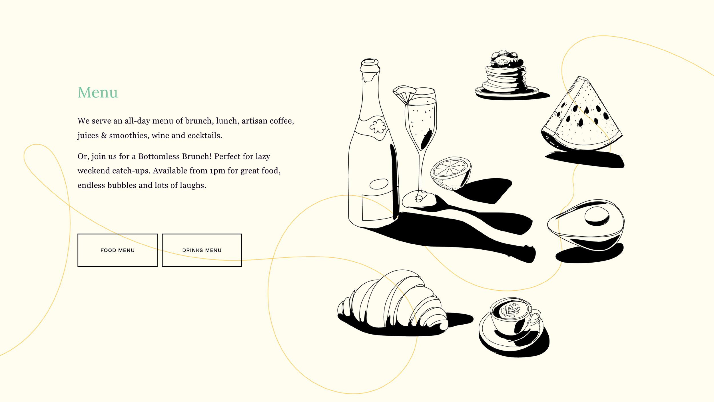
Menu
A structured layout keeps things clear, while wandering illustrations soften the edges. Together, they strike a quiet balance between order and ease — a subtle cue to slow down, let go, and enjoy the moment.

Tote Bag
Bold and breezy, the tote carries a spirit of casual joy — drinks, lemons, a loose line that loops and sways. Practical, yes, but not without charm.


Poster
With a wink and a splash, this playful poster invites guests to dive into weekend indulgence. A visual nod to carefree Saturdays, it captures the spirit of bottomless brunch without saying too much.

Website
The website is where most people meet Hally’s for the first time — so it had to feel immediate, welcoming, and full of life. The illustrations do a lot of the heavy lifting here. Playful, responsive, and thoughtfully placed, they animate the brand’s personality in a way words alone can’t. Whether leading you to a booking, highlighting the latest seasonal dish, or simply adding charm to a quiet corner of the page, the drawn elements create a sense of place. A kind of casual choreography unfolds as users move through — functional, but with feeling.


Testimonial
I’ve worked with Jason for over ten years, most recently on the rebrand of my café, Hally’s. He landed on a visual concept that’s bold, tasteful and totally original — it helped us stand out while still feeling completely like us. From the beautiful, hand-drawn illustrations to the website and menus, every detail was thoughtful and distinctive. Jason’s creative instincts are spot on, and he’s an absolute pleasure to work with from start to finish.
Anna Halliday
Founder, Hally’s
