

Sussex
Six birds,
one stone
About Sussex
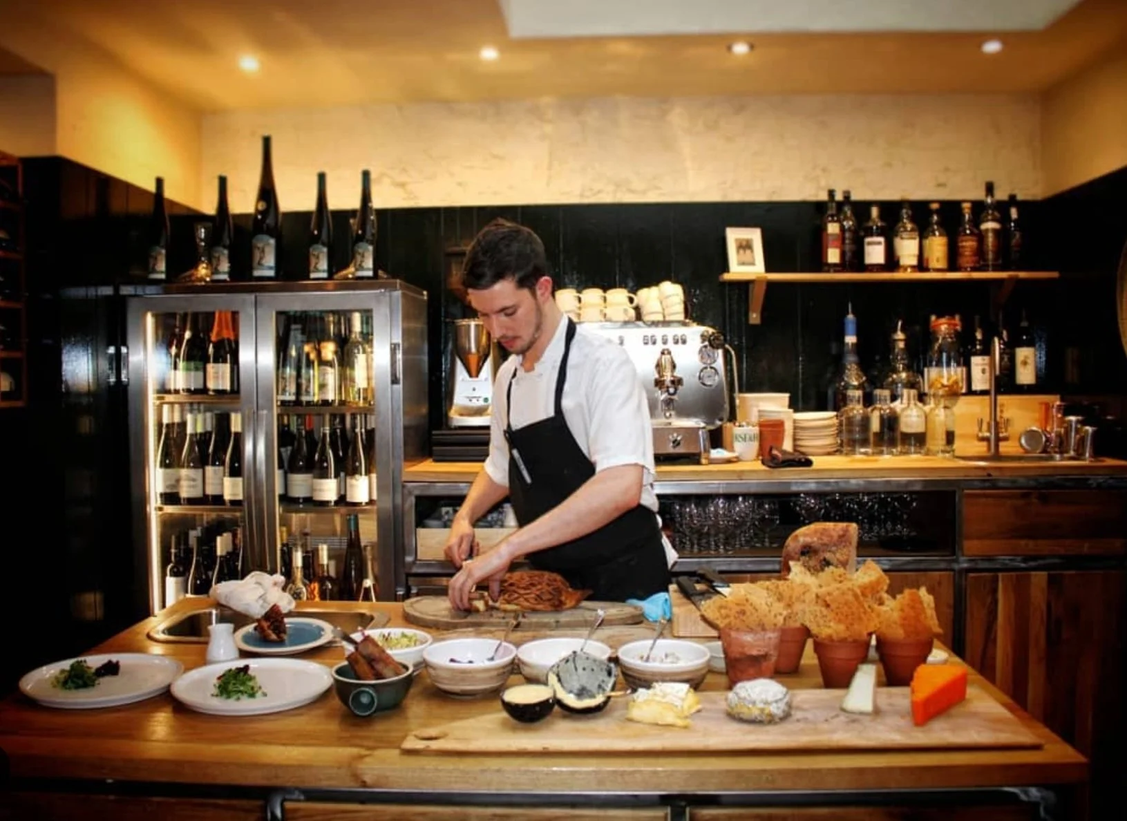
The Gladwin Brothers, also known as Local & Wild, have opened their 7th location in London, and it's something special. The Fat Badger isn’t just a restaurant; it also features an on-site farm shop. Known for their seasonal menus, the Gladwin Brothers have extended this concept to the grocer, offering seasonal ingredients. The ambiance is warm and inviting, reflecting their commitment to fresh, local produce and a unique dining experience.
The Backstory
Sussex, the flagship wine bar and restaurant from the Gladwin Brothers, needed to feel distinct — refined, intentional, and deeply rooted in place. The solution began with a discovery: Sussex is the only English county whose flag features six golden martlets arranged in a triangular formation. It’s a subtle but striking visual cue — and a perfect opportunity for typographic storytelling.
Rather than create a logo in the conventional sense, I let the name SUSSEX take its place — set over three lines in a triangular grid that mirrors the county flag.
The result is a mark that rewards curiosity: instantly recognisable to locals and rich with layered meaning for others. The “X” on the third line anchors the composition like a keystone — its symmetry grounding the layout in a way no other letter could.
Project Deliverables
Logo design
Brand development
Bag design
Logo design
Layout & Typography
Positioning story:
Six birds, one stone
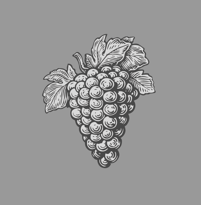
A nod to the clients wine farm in the Sussex region.
Wine grapes
+

Sussex flag
The flag of sussex county with it’s layout unique to all other county flags.
+

Type
Using a familiar typewriter font implies classic ethos.
=
Wordmark
Sussex Logo


The triangular structure also became a flexible visual system. The birds (martlets) could be swapped out for other icons — six coffee beans for takeaway branding, six wine droplets for the wine list, six wildflowers for seasonal menus.
Each interpretation maintains the visual rhythm while shifting tone, allowing the concept to scale across touchpoints without losing its meaning.
At its heart, the identity is about restraint — using typographic intelligence and historical cues to create something elegant, resonant, and distinctly Sussex.

Posters
Each event poster subtly references the six martlets of the Sussex flag through a triangular arrangement — six small plates for Tapas Night, six glass silhouettes for Cocktail Hour, six abstract forms for the gallery event. This visual device creates quiet continuity across the campaign while leaving room for variation. It’s a system rooted in place, flexible in application, and capable of growing with future events.
The Darkest of Greens
CMYK: 58, 41, 45, 1 R
RGB: 113, 127, 126
HEX: #192a23
The Lightest of Lavendars
CMYK: 58, 41, 45, 1 R
RGB: 113, 127, 126
HEX: #717f7e


Colour and Font
Colours
The colour palette continues the Sussex region conversation: The Darkest of Greens grounds the identity, evoking dense woodlands and the deep tonal qualities of the South Downs. In contrast, the Lightest of :avenders adds an unexpected brightness — a breath of Sussex spring. Together, these colours mirror the natural and seasonal balance at the heart of the menu: earthy, refined, and quietly expressive. This pairing is minimal but rich in meaning — grounding the visual identity in place and seasonality, much like the food itself.
Fonts
The visual language of Sussex is built on quiet contrast. For typography, I chose Prestige Elite, a monospaced typewriter font designed by Howard Kettler in 1953. Originally created for efficient, legible output on typewriters, its evenly spaced, mechanical rhythm adds structure and a sense of deliberation to the brand. Here, it serves as both a nod to literary tradition and a subtle reminder of craft — a fitting match for a restaurant that values precision and storytelling.
Menu
The menu is presented like a clothbound book — a small gesture that hints at story, permanence, and care. Inside, the design is minimal and deliberate, allowing the food to take the lead. The concept echoes the larger Sussex narrative: considered, grounded, and rooted in detail. Business cards and coasters follow suit — understated, tactile, and part of the same language.

Testimonial
“Since launching our first restaurant, The Shed, in 2012, we've had the privilege of collaborating with Jason de Villiers.
Now, with six thriving restaurants across London, Jason's unparalleled creativity and vision have been essential at every turn. His innovative input is a game-changer for any new business!”
Richard Gladwin
CEO. Local & Wild.
