Selected
brandmarks
About the process
Behind every simple logo is a not-so-simple idea. The marks I create are rooted in strategy, story, and reduction — striking a balance between clarity and meaning. Each logo begins as a thought experiment: how do you express the soul of a brand using as little as possible? The answer often lies in dualities — function and feeling, concept and form. This is a look behind the curtain — how recognisable, concept-led logos come to life.
Logos don’t appear fully formed. They’re shaped by conversation, research, sketching, and editing. In this stage of work, I’m often chasing a visual metaphor, a point of friction, or a clever connection that helps the identity click into place.
My approach is structured but intuitive:
Start with meaning
Strip away what isn’t necessary
Shape what remains into something that feels inevitable
What you’ll see here is a reduction of a reduction — the core thought behind each mark.
The Backstory
Every logo starts with listening. The early part of the process is about getting close to the brand — its personality, its ambitions, and the people behind it. These aren’t just design briefs, they’re stories in motion. I look for the tension points, the values beneath the surface, and the language people use when they speak with real conviction. That’s often where the best ideas are hiding.
From there, it’s about distillation. I collect references, sketch ideas, explore metaphors, and search for patterns that feel both familiar and surprising. The goal is to find a simple visual expression that holds weight — a logo that feels inevitable once you see it, but impossible to forget after you do.
Moodboards are pulled, reference points considered. But more often than not, the solution arrives when two distinct ideas lock together. That’s where the spark is.
That’s where the logo begins.
Project Deliverables
Logo / wordmark
Brandmark variations
Logo construction (concept breakdown)
Typography and colour guidance
Sussex:
Six birds, One stone
The Sussex logo began with a detail hiding in plain sight: the county flag, marked by six birds arranged in a triangular formation. That composition became the foundation for the wordmark — six letters, structured in the same geometry, quietly nodding to the region's heritage. Set in a typewriter font, it brings together literary history, thoughtful construction, and a subtle sense of weight. It’s a logo that rewards attention — familiar at a glance, and full of meaning just beneath the surface.

The Sussex flag
+

Type
=

Tortuga Loca:
MEXICAN RADIANCE
For this bold and vibrant Mexican kitchen, the logo brings together symbolism from both faith and folklore. At its centre, a sharp monogram “T” radiates outwards — rays breaking from a hexagonal frame. The hexagon nods to the shape of a tortoise shell plate, while the radiant lines are inspired by the iconography of Our Lady of Guadalupe. The result is a mark that feels both grounded and glowing.

Our Lady of Guadalupe
+
Tortoise shell

=

Wilma:
Caring First
Wilma is a service that supports people through the challenging days after losing a loved one, making estate transfers clearer and easier.
The logo uses rounded letterforms and subtle details, like a small heart in the ‘m’, to convey warmth and care. Unlike the neutral tones and script fonts common in the industry, Wilma presents a modern, comforting, and quietly optimistic look.

Warm font
+

Heart
=

Good Luck:
Bottled Goodness
This bottled citrus brand brings together grapefruit, blood orange, and lime — three fruits with punch, personality, and a touch of bite. The wordmark is divided into eight even segments, reflecting not only the natural geometry of citrus fruit when cut crosswise, but the brand’s core values: simple, and full of character.
The segmented structure makes the identity feel both playful and precise — like something just peeled back and ready to taste.
Good
Luck
Brand name

Citrus

+
=
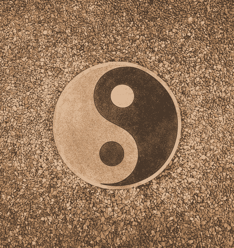
Outlier Health:
Eternal balance
Balance sits at the heart of Outlier Medicine — a practice rooted in Eastern traditions, where health is viewed as harmony. The logo draws from the yin-yang symbol, reinterpreting it within the form of a single letter: the “O”. This subtle nod to duality and equilibrium transforms the brand’s first initial into a visual representation of its deeper philosophy. Clean, quiet, and deliberate — a mark designed to restore calm and clarity at a glance.
Outlier
health
Brand name
Yin-Yang
+
=
Fuse: Sparking
a conversation
Fuse is a set of spark cards designed to help people grow closer — one meaningful conversation at a time. The logo is built from a single continuous line, looping in the centre to reveal us. It’s a quiet symbol of unity, with the F and E emerging from negative space — subtle but deliberate.
The name itself holds dual meaning: to ignite, and to bring together. The identity does the same — simple on the surface, but charged with intention.

Fuse

US
+
=
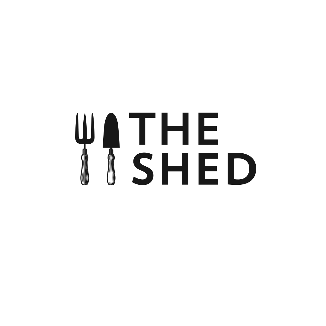
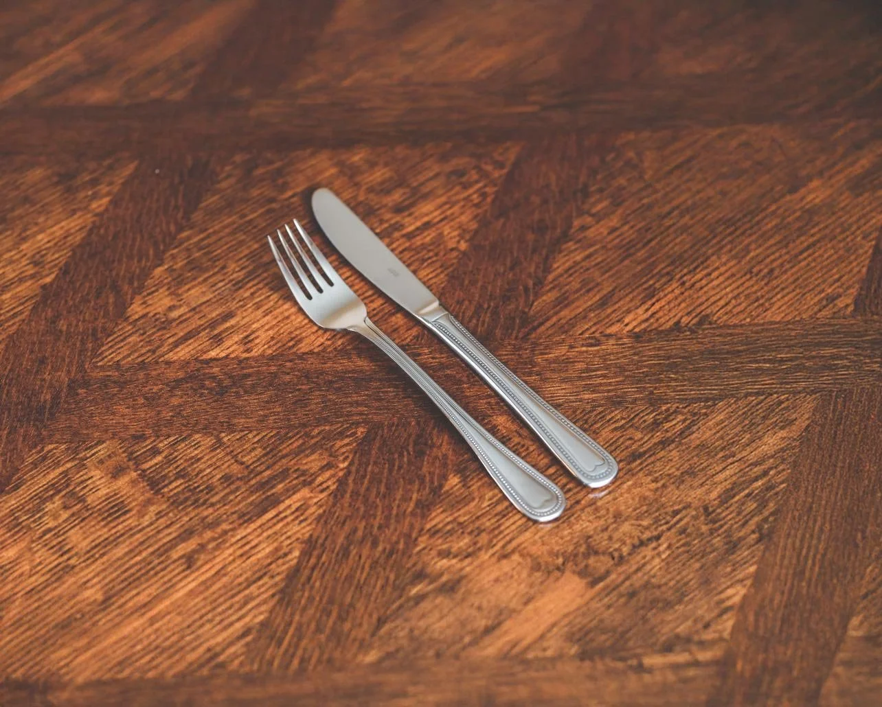
The Shed:
Farm to Fork
Some logos tell you everything in a glance. For The Shed, a farm-to-fork restaurant, I replaced the usual knife and fork symbol with a gardener’s fork and trowel — tools of the soil instead of the kitchen. It’s a quiet visual shift, but one that reframes the entire experience. The result is a mark that’s both familiar and surprising, reinforcing the restaurant’s ethos: that great food starts in the ground.

Gardening
Dining