
The Fat Badger
A farmer walks into a bar…
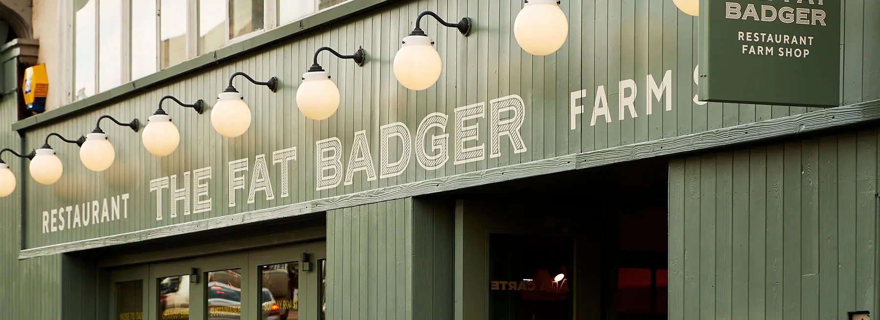
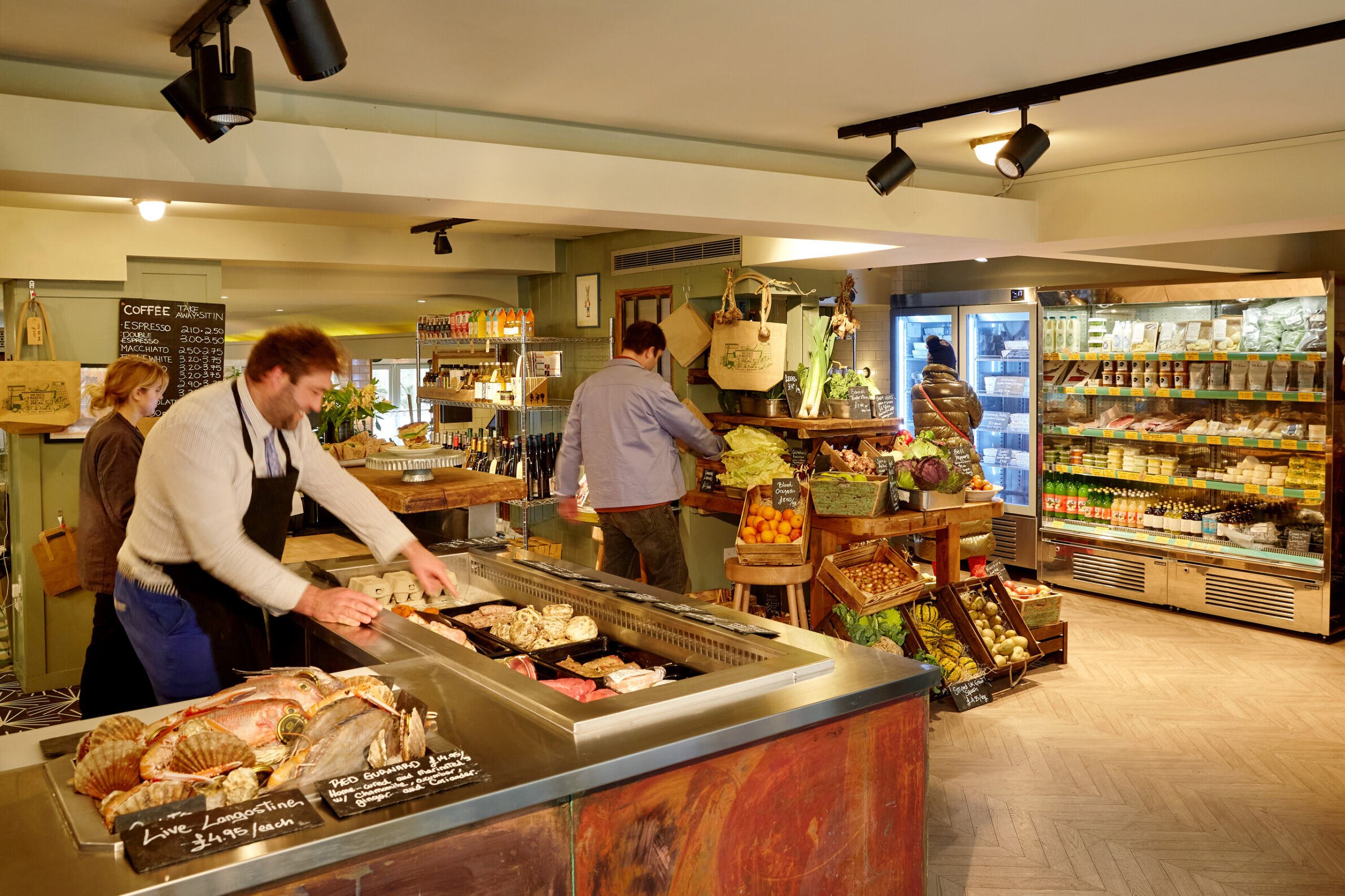
About The Fat Badger
The Gladwin Brothers, also known as Local & Wild, have opened their 7th location in London, and it's something special. The Fat Badger isn’t just a restaurant; it also features an on-site farm shop. Known for their seasonal menus, the Gladwin Brothers have extended this concept to the grocer, offering seasonal ingredients. The ambiance is warm and inviting, reflecting their commitment to fresh, local produce and a unique dining experience.
The Backstory
The Gladwin Brothers reached out to me to design the logo for the Fat Badger. They wanted a unique visual identity that would establish this location as both a restaurant and a fresh grocer. The logo needed to resonate with their current clientele while also attracting new visitors. This project was an exciting challenge, blending the elements of a fine dining restaurant with a farm shop to create a cohesive and appealing brand.
Project Deliverables
Logo design
Brand development
Bag design
Logo design
Layout & Typography

Moodboard
Establishing the visual direction
The Gladwin Bros. had a clear idea of what The Fat Badger was going to do, and who it needed to attract. I combined a moodboard with handwritten notes to show what was appealing within the images. The moodboard consisted of handpainted signage, the emphasis was on typography and the creative execution of it.
We loved the texture of one of the older signs, the way that it had been weathered, this was inspiration to adding a texture within the letterforms, we also liked the arcs that serve both as compositional and decorative elements, so we borrowed that in our final design.
Logo development


A flexible visual system for all applications.


Camo Green
CMYK: 58, 41, 45, 1 R
RGB: 113, 127, 126
HEX: #717f7e
Lichen
CMYK: 58, 41, 45, 1 R
RGB: 113, 127, 126
HEX: #717f7e

Colour and Font choice
Colours
For the colour palette, I selected two shades that reflect The Fat Badger’s farm-to-fork ethos while drawing inspiration from nature. "Camo Green" captures the earthy tones of fresh produce and the outdoors, while "Lichen" evokes the soft, mossy greens found in nature, creating a harmonious, organic feel.
Fonts
I paired TT Norms, a humanist sans-serif, with Copperplate Extended, a classic serif font. The relationship between the two typefaces is one of balance and contrast. TT Norms offers a clean, modern aesthetic with a neutral, approachable feel that makes it highly versatile. Its geometric simplicity and wide letterforms create an open, readable structure, ideal for body copy and subtitles.
On the other hand, Copperplate Extended introduces a more traditional, structured feel with its distinctive, sharp serifs and elegant proportions. The extended letterforms of Copperplate provide a sense of refinement and authority, while the boldness of the serifs ensures it stands out in the headline.
Together, these typefaces complement one another by creating a dynamic contrast between the modern, understated quality of TT Norms and the timeless, authoritative presence of Copperplate Extended. This pairing strikes a balance between heritage and modernity, providing both clarity and sophistication across various uses.

Poster Design
I designed a poster that blends the farm-to-fork ethos with a playful musical twist. The headline, “Lettuce, Turnip the beet”, combines fresh produce with a clever pun, adding a fun and lighthearted vibe to the restaurant’s brand. The visuals feature a dynamic mix of botanical illustrations and musical instruments, all crafted to echo the restaurant’s unique blend of natural, seasonal ingredients and lively atmosphere. This design captures the essence of The Fat Badger, where food and music come together in perfect harmony.

Tote Bag
This tote bag design reflects The Fat Badger’s focus on fresh ingredients and simple, delicious food. One side features a pesto recipe, while the other side illustrates the key ingredients and tools used to make it. The design brings a sense of fun and functionality, capturing the essence of the restaurant’s farm-to-fork philosophy in a practical yet playful way.


Testimonial
“Since launching our first restaurant, The Shed, in 2012, we've had the privilege of collaborating with Jason de Villiers.
Now, with six thriving restaurants across London, Jason's unparalleled creativity and vision have been essential at every turn. His innovative input is a game-changer for any new business!”
Richard Gladwin
CEO. Local & Wild.
