

EARNT Case Study
Natural Resistance
About EARNT
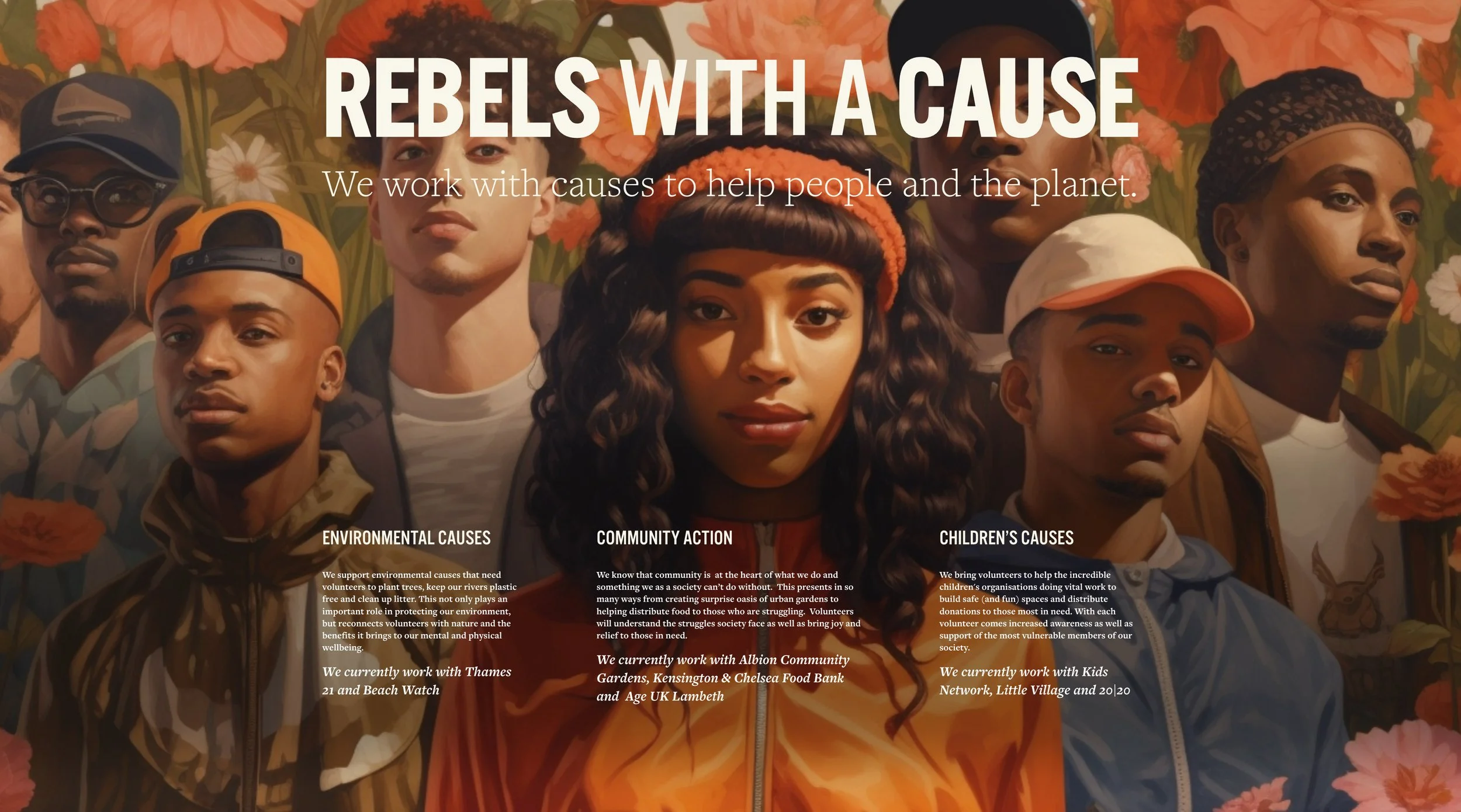
At its core, EARNT is a brand powered by purpose, community, and action — but its early outward presence didn’t reflect the energy or ambition behind its mission. While the foundation was beautifully considered (with branding by Paris Marseille), it needed a distinctive visual layer to amplify the message: this isn’t just sustainability, it’s a cultural movement.
EARNT has a unique approach to environmental change. EARNT was launched with the simple idea that people will go to crazy lengths to get exclusive access and VIP treatment from their favorite brands, restaurants, and performers.
The brand’s focus is on making the world cleaner and better through collaboration. EARNT collaborates with brands to reward participants of environmentally conscious acts with limited edition or often one-of-a-kind deals, such as a secret menu at the River Club in London or a free coffee (for you and the person behind you) at HAGEN. If you like making the world a better place, engaging with like-minded people, and being rewarded with exclusive, limited edition ETYs (EARNT Thank Yous), go to EARNT.co.uk and make the world a better place.
The Backstory
I was contacted by EARNT’s founders to help refine their brand positioning. EARNT already had a visual identity, but they needed assistance in accurately portraying the brand narrative in a way that felt cool, compelling, and, most importantly, reached the right audience.
Two things immediately stood out: the brand line, “A revolution in consumption”, and the logo rationale, “the world as your playground.” These weren’t just design decisions — they were strategic invitations to reimagine how people engage with doing good. And they became my compass.
Using these as guiding stars, I curated a strong, cohesive visual direction that sat at a very deliberate intersection:
Revolutionary poster art: drawing on the powerful composition, colour blocking, and emotive language of revolution-era propaganda posters.
Street and activewear culture: styling that spoke to a modern, urban audience who care about image and impact in equal measure.
Nature: lush, green backdrops that retained the brand’s environmental backbone.
The result was a suite of highly styled, editorial images that felt equal parts campaign and cause — designed, not just informative. The type treatments echoed this approach, referencing poster layouts and activist slogans, and I refined the existing typography for better legibility and balance across platforms. The serif was replaced with a more versatile typeface, and the logo font was updated for better cohesion and clarity.
This refreshed direction rolled out across all of EARNT’s collateral: from a full website redesign to press and pitch materials, print flyers, and digital templates. It gave the brand a distinct identity in a space often crowded with earnestness but lacking in cultural pull. EARNT became something people wanted to wear, share, and shout about — the start of a movement, not just a marketplace.
Project Deliverables
Visual brand direction
Website design
Imagery and art direction
Presentation and pitch deck design
Event flyers and printed collateral
Logo design
(Team EARNT)

Positioning Story: Natural Resistance
Revolution
Drawing on the powerful composition, colour blocking, and emotive language of revolution-era propaganda posters.
These posters often depict a strong sense of togetherness towards a common goal.
+

Street culture
Styling that speaks to a modern, urban audience who care about image and impact in equal measure.
+

Nature
Lush, green backdrops that retained the brand’s environmental backbone. Nature is the essential ingredient to bringing the concept to life.
=

EARNT
A community of change makers who believe actions speak louder than money.
Website
The website is where people sign up, take part, and learn what EARNT is all about. Designed as a clear and confident platform, it reflects the energy of the brand while guiding users toward real action. From layout to imagery, every element is there to support the movement — and make it easy to join.

TEAM EARNT
To create intrigue and drive brand awareness, we designed exclusive t-shirts and caps that featured a tiger motif, reminiscent of old sports club logos. The tiger was a clever play on the phrase "Earn your stripes," symbolizing both achievement and the brand's ethos. Aligned with EARNT’s values, these items couldn’t be bought; they had to be earned.
The exclusive merchandise was only given to participants at EARNT’s events, reinforcing the brand’s community-centric approach and rewarding those who contribute to making the world a better place. Each t-shirt and cap echoed EARNT’s mantra, “Earn your stripes,” subtly woven into the design to remind wearers and observers alike of the brand’s mission.
By incorporating the tiger and the “Earn your stripes” message, we not only created desirable and unique items but also fostered a sense of accomplishment and belonging among participants. This strategy not only enhanced brand visibility but also deepened the emotional connection between EARNT and its community, turning every wearer into a proud ambassador of the brand.


Testimonial
"I've worked in communications for over 20 years and sent countless briefs to designers — but the one we gave Jason was easily one of the most challenging:
‘Make EARNT feel like it's for everyone, everywhere, without losing clarity or cool — and communicate a totally new idea.’
He nailed it in one go. His creative vision took the brand into spaces we’d only imagined. It wasn’t just the work — it was his intuition, clarity, and rare understanding of people that made the difference. I've never experienced a creative partnership like it."
Lauren Scott-Harris
Founder, EARNT
